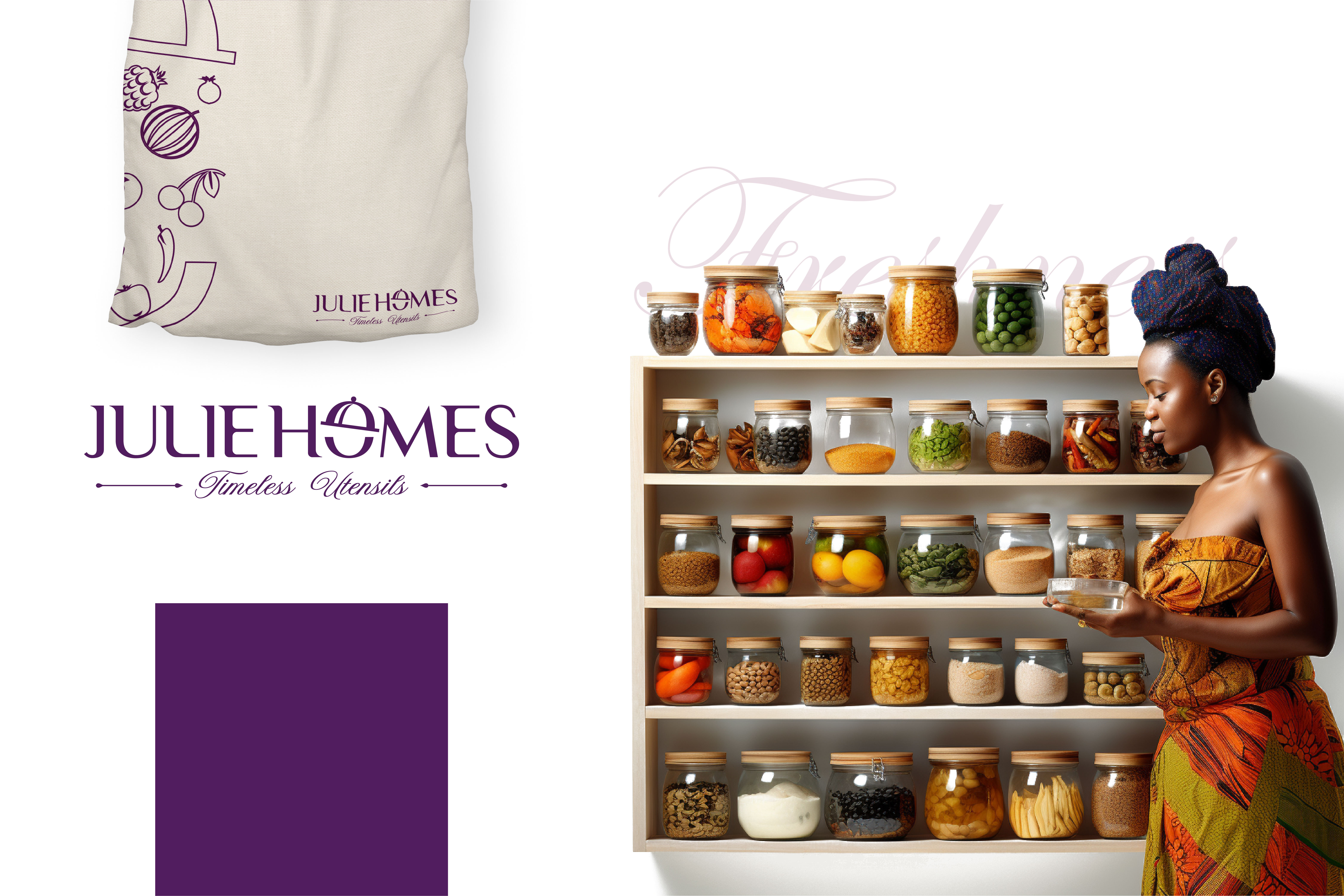
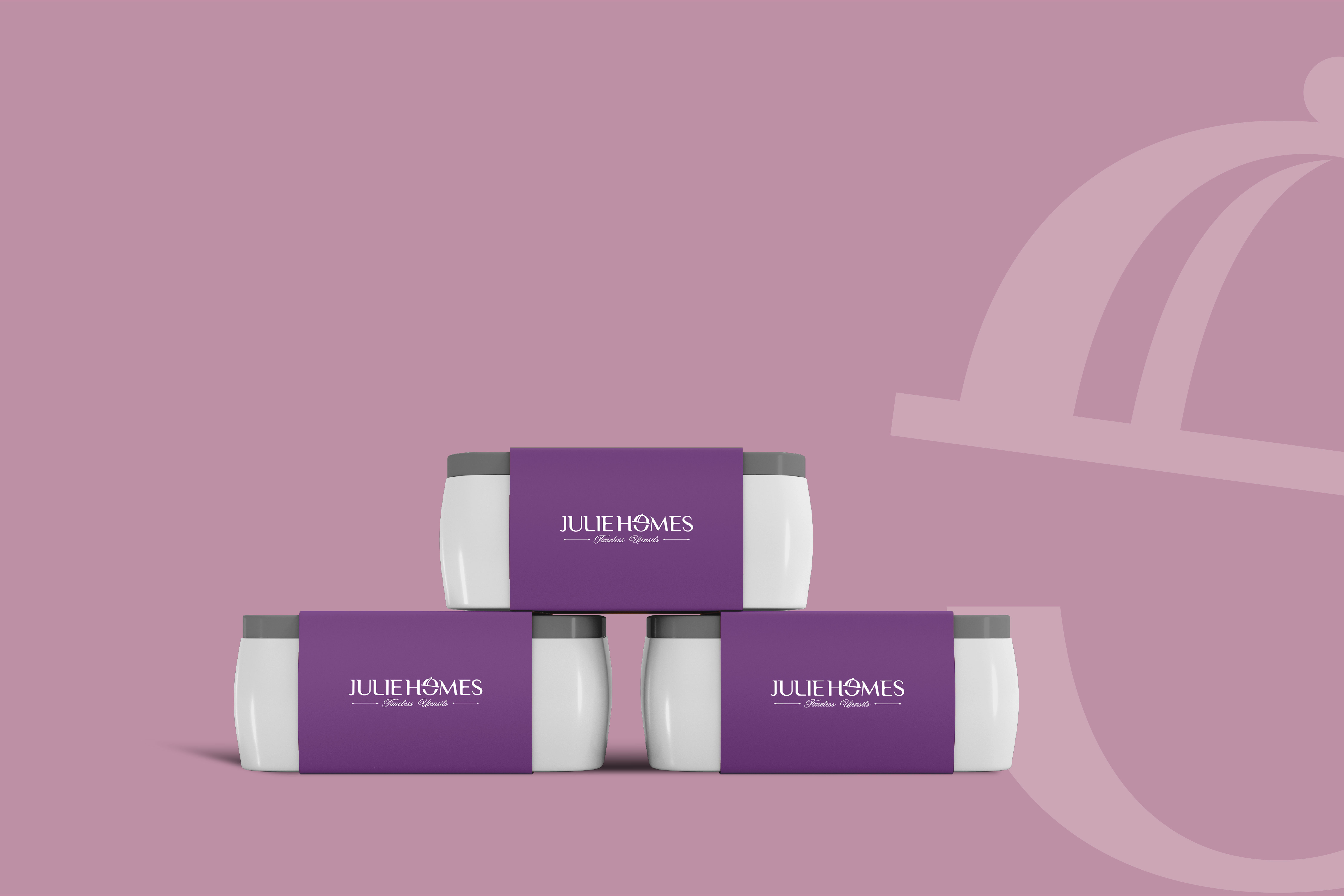
Julie Homes

Challenge

Re-launching a shop that needed a refreshed brand that felt modern, clear, and competitive, while clearly communicating quality and everyday usefulness in a crowded kitchen.

The Client

This project focused on creating a cohesive visual identity that could articulate the brand’s personality with clarity and confidence. We partnered closely with the client to understand their goals, audience, and long-term vision, then translated those insights into a modern logo system supported by thoughtful typography, color, and layout choices. The final identity gives the brand a unified visual presence that feels consistent across digital, print, and social environments.
Scope of service
Industry
  1. Visual identity system: Logo, color system, typography.
  2. Graphic language: Iconography, pattern system.
  3. Brand Guidelines.

Household storage

Impact

↑ 2.5% NPS
2% conversions
A successful market launch with high early brand recognition, increased engagement.
A successful market launch with high early brand recognition, increased engagement, and contributed to strong digital and physical presence; conversion and trust with early users and partners.

Our Approach

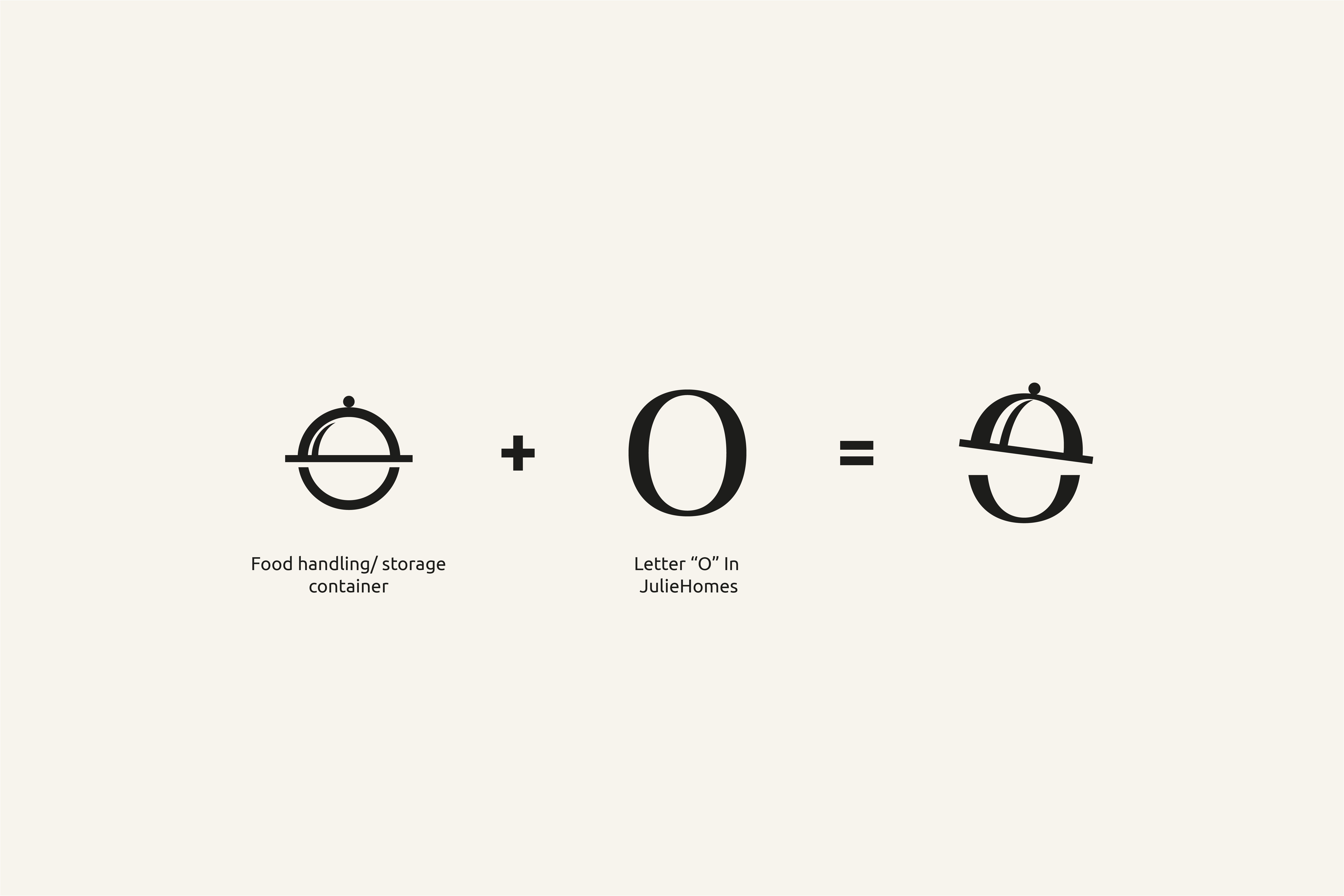
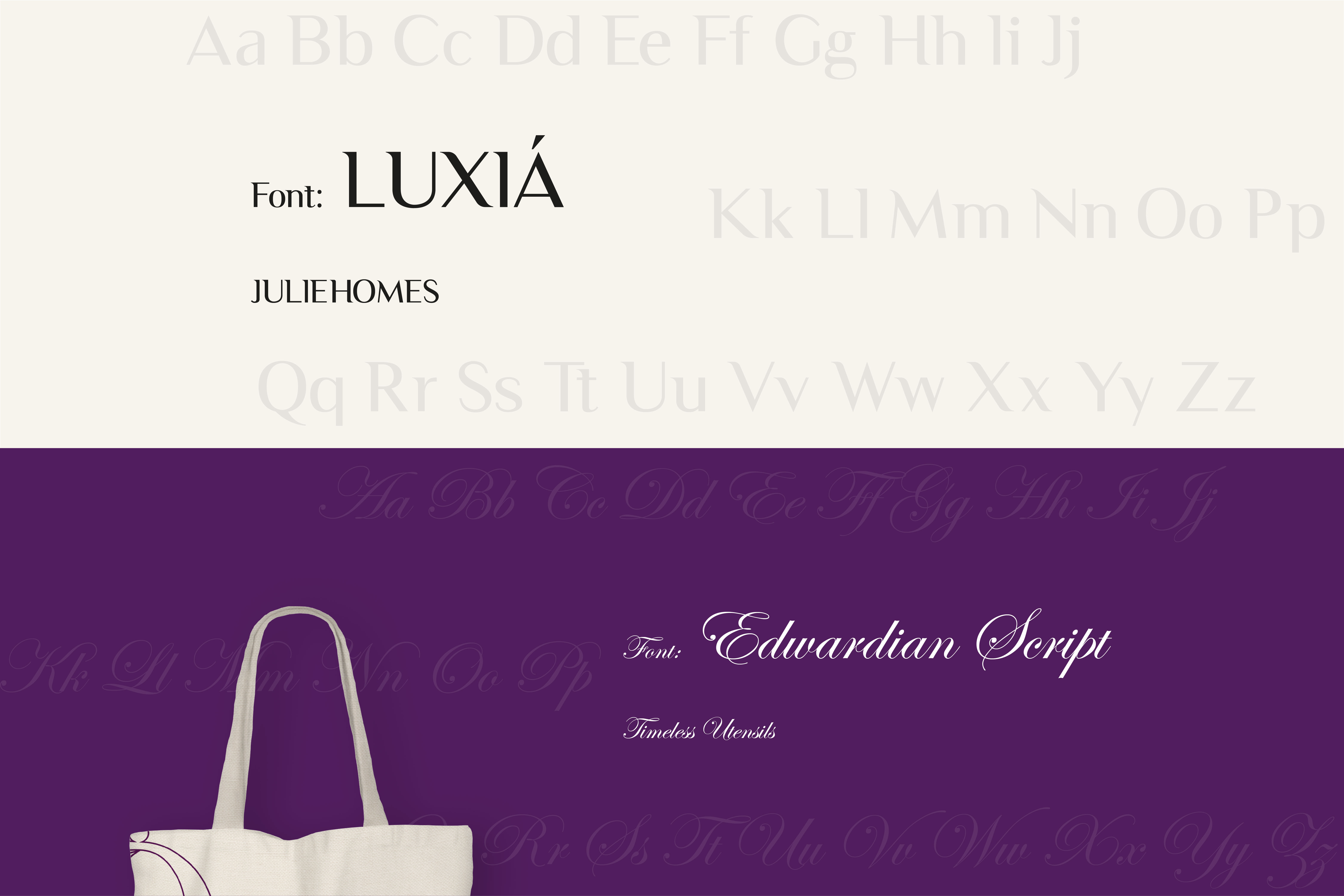
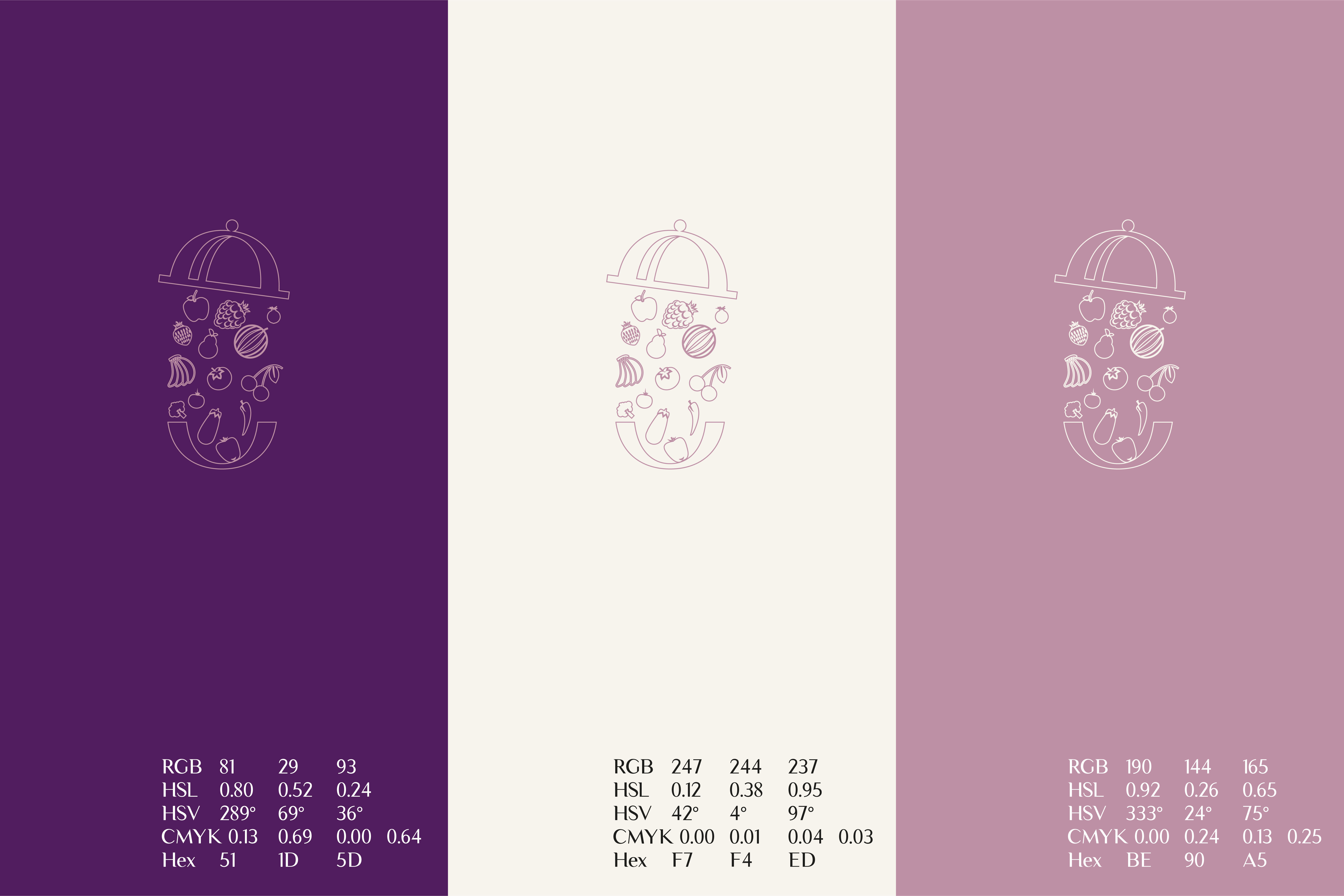
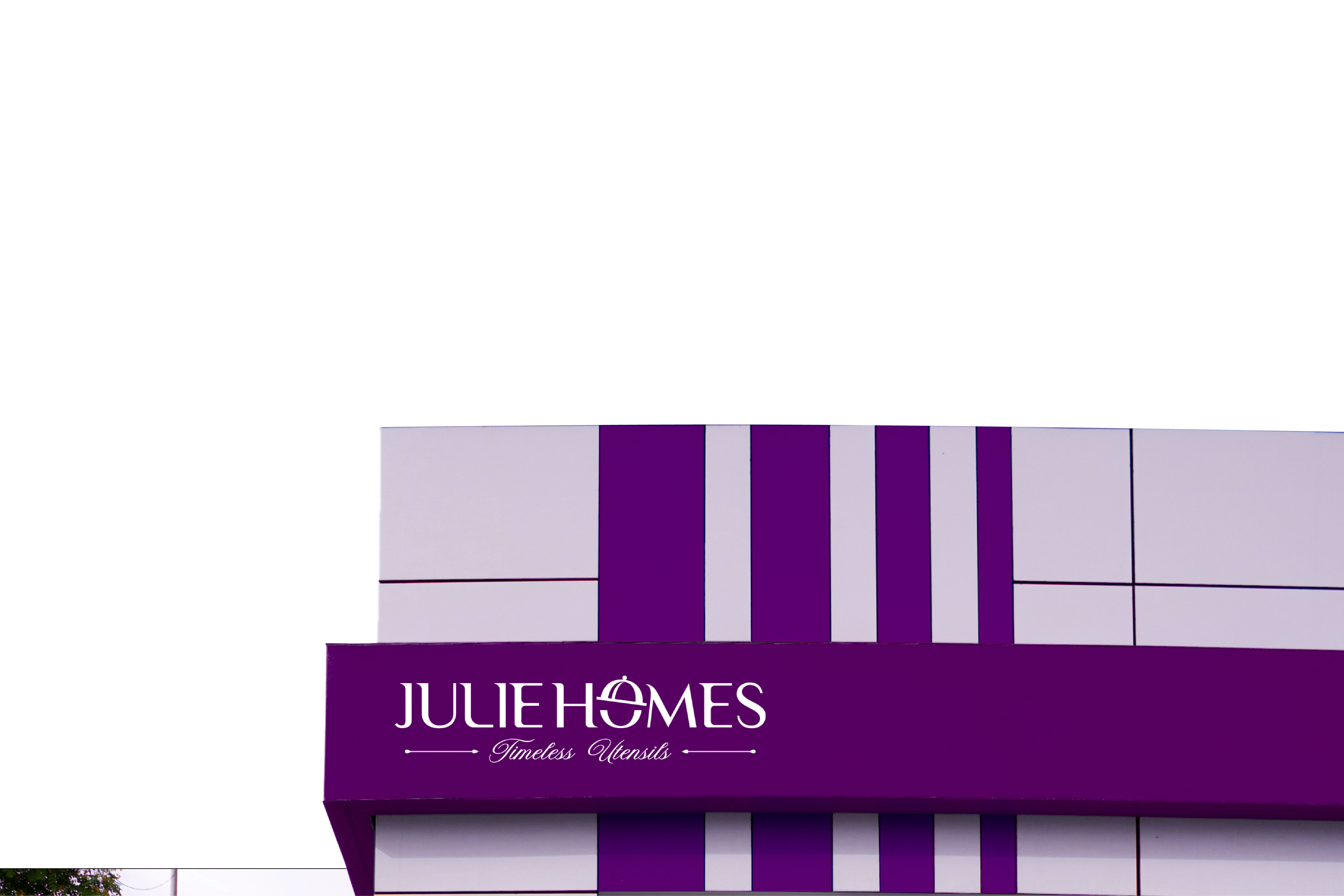
Our approach started with uncovering the narrative at the heart of the brand. We translated those themes into visual concepts—some bold, some subtle—to see how the story could live in graphic form. As we refined the direction, we shaped a logo that’s clean and meaningful, supported by a color and type system that reinforces the brand’s personality. The final identity is the result of close collaboration and careful craft, designed to feel consistent, expressive, and instantly recognizable across every platform.

No items found.

Mishek M.

CTO, Julie Homes

"The logo hit exactly the right balance between modern and memorable. The mark feels simple at first glance, but the subtle geometry gives it a sense of intention and craft. I really like how the color palette carries through both dark and light backgrounds without losing clarity. If I had one small note, it’s that the spacing between the icon and the wordmark could open up just a hair for better breathing room but overall, it looks polished, versatile, and ready to live across packaging, web, and social. "

September 21, 2020

Lets get you started on your design journey as well.

Start your project