GloC Shop
Branding
This is some text inside of a div block.
Brand Identity Design

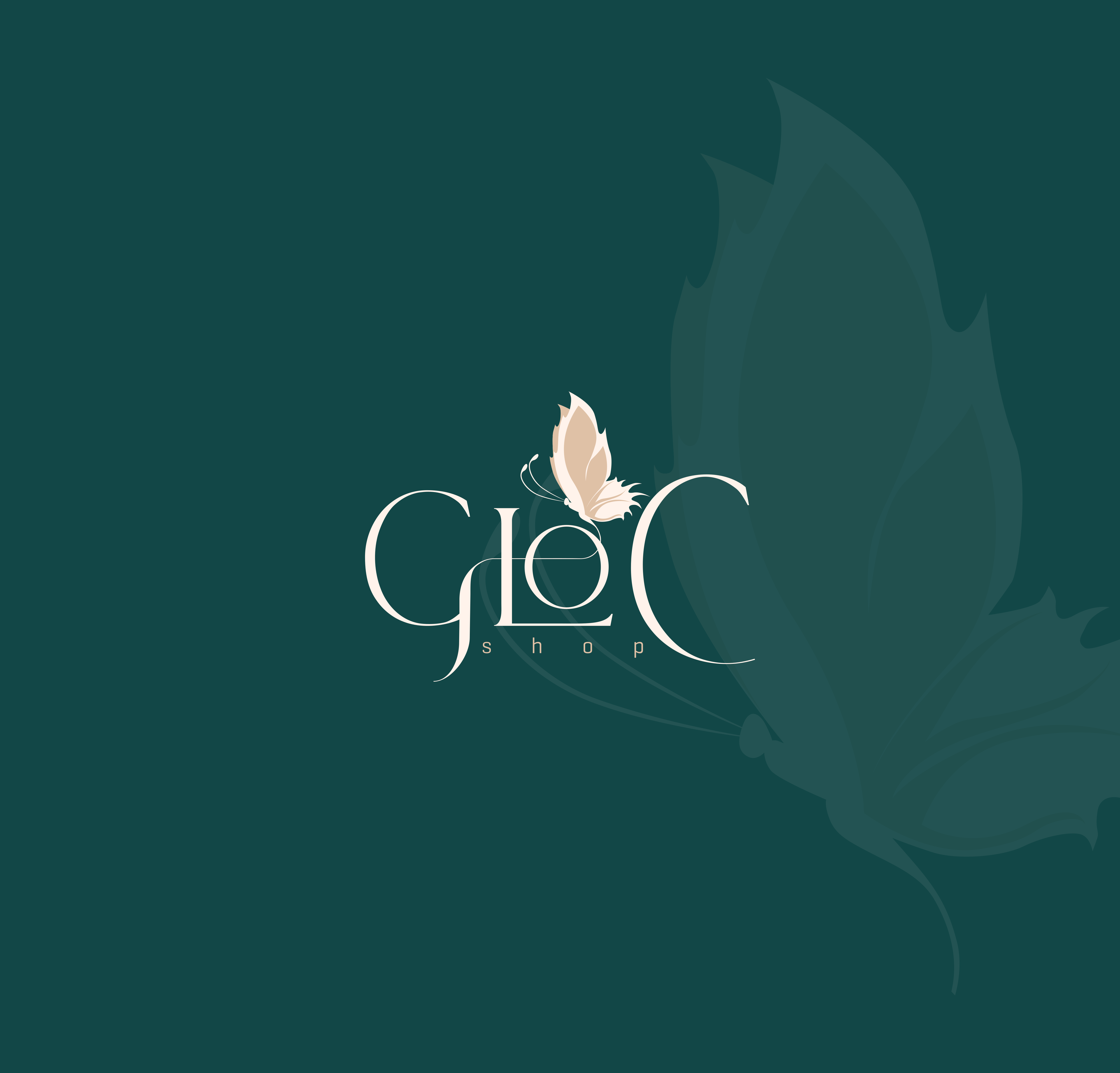
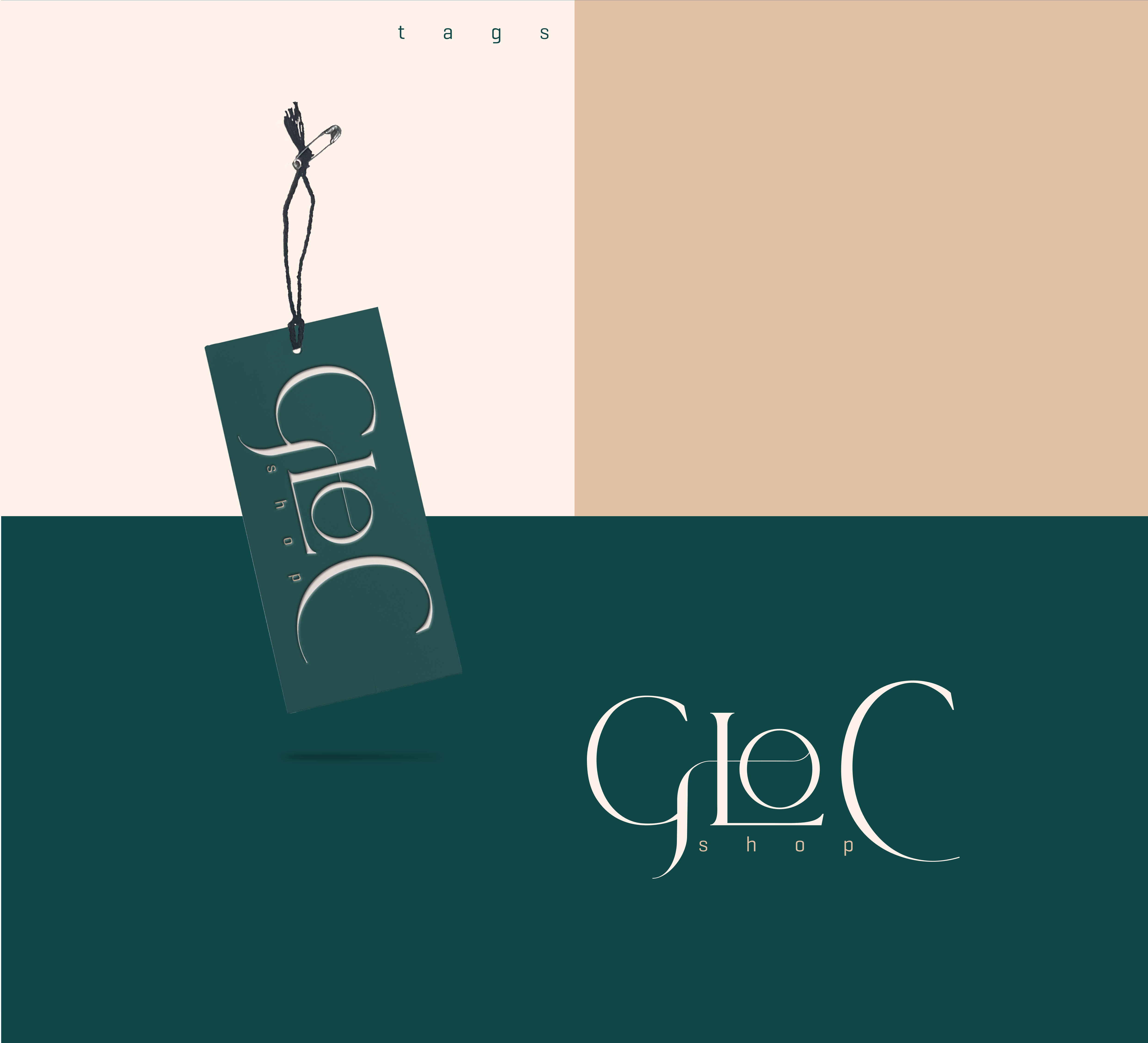
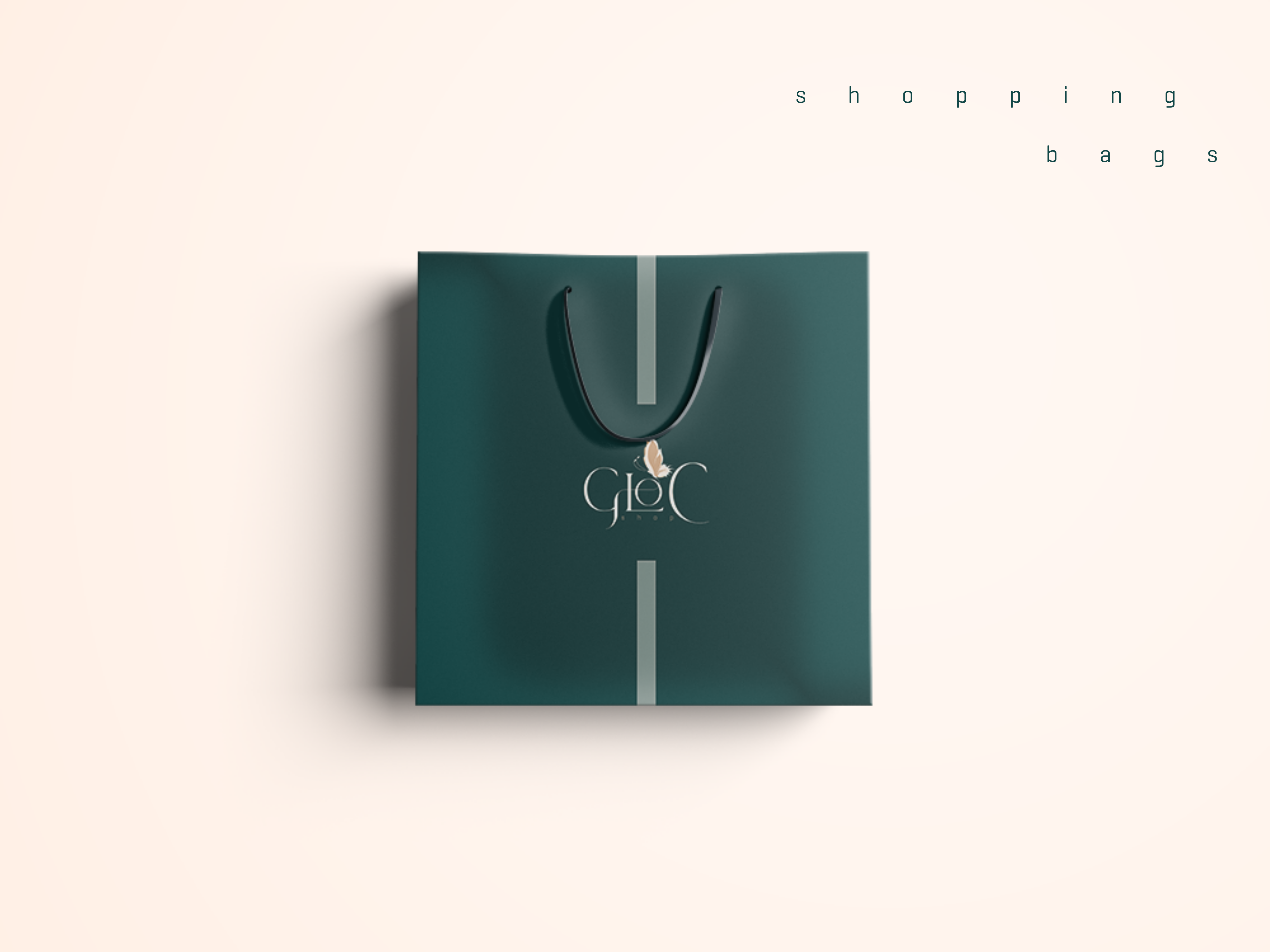
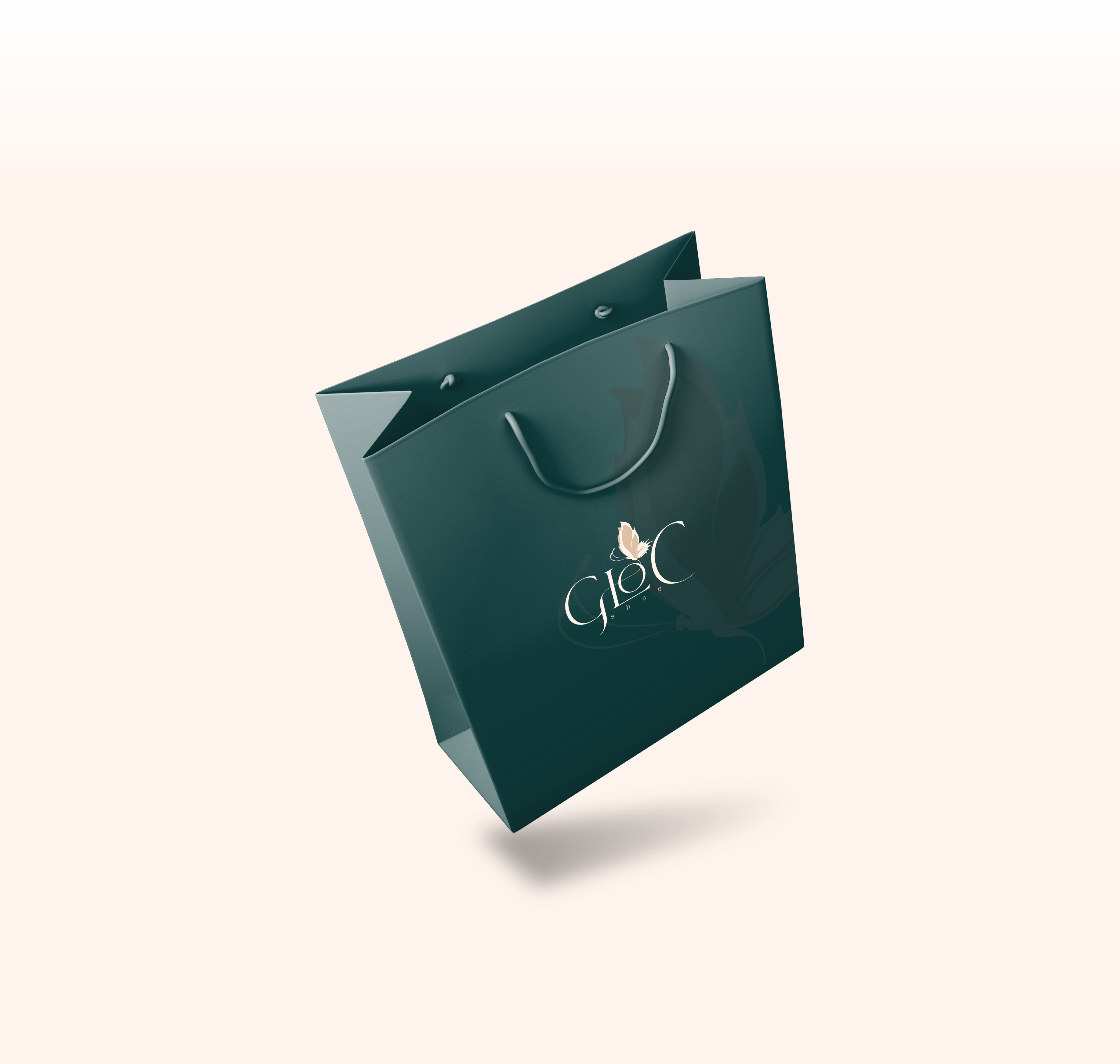
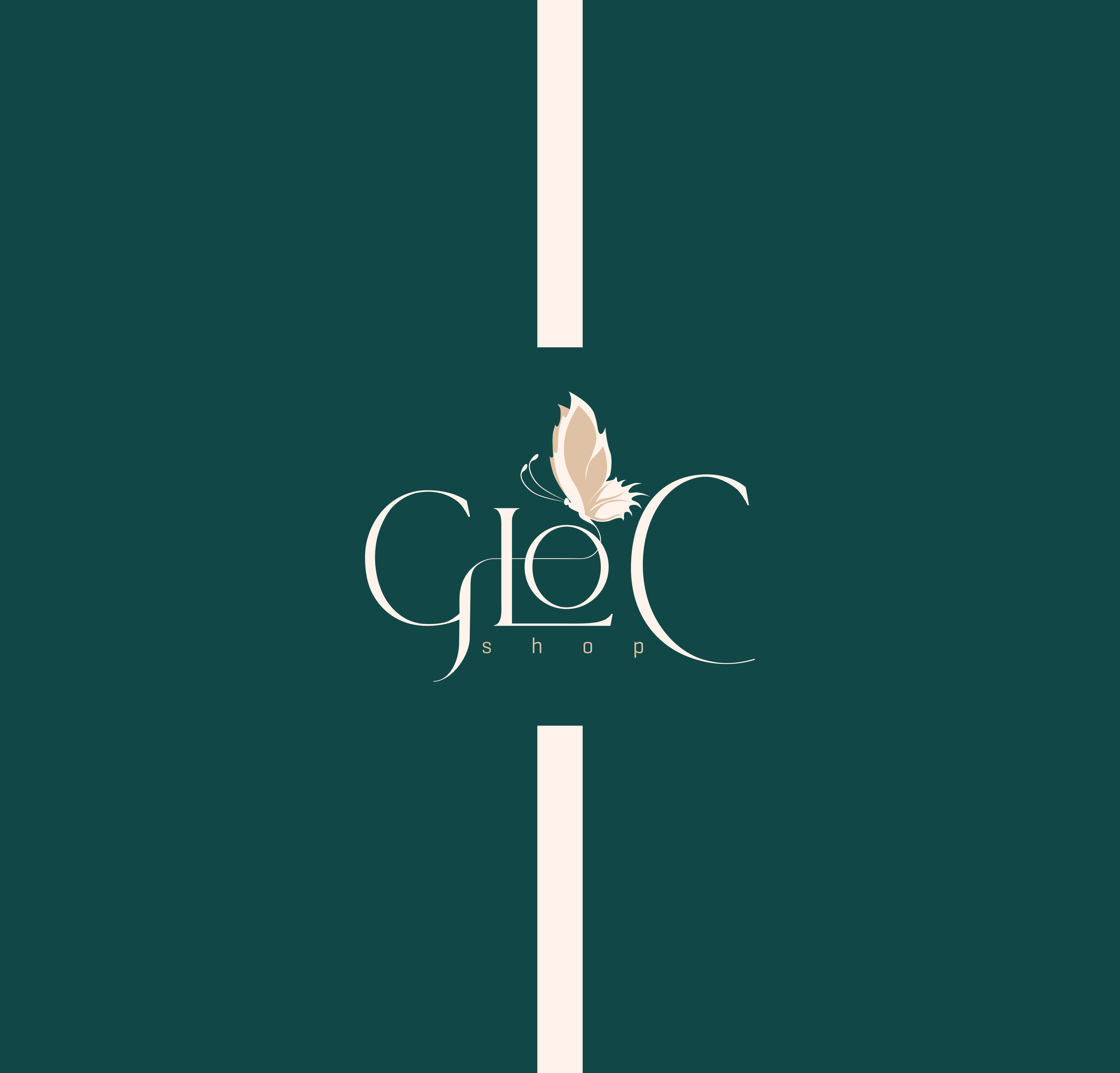
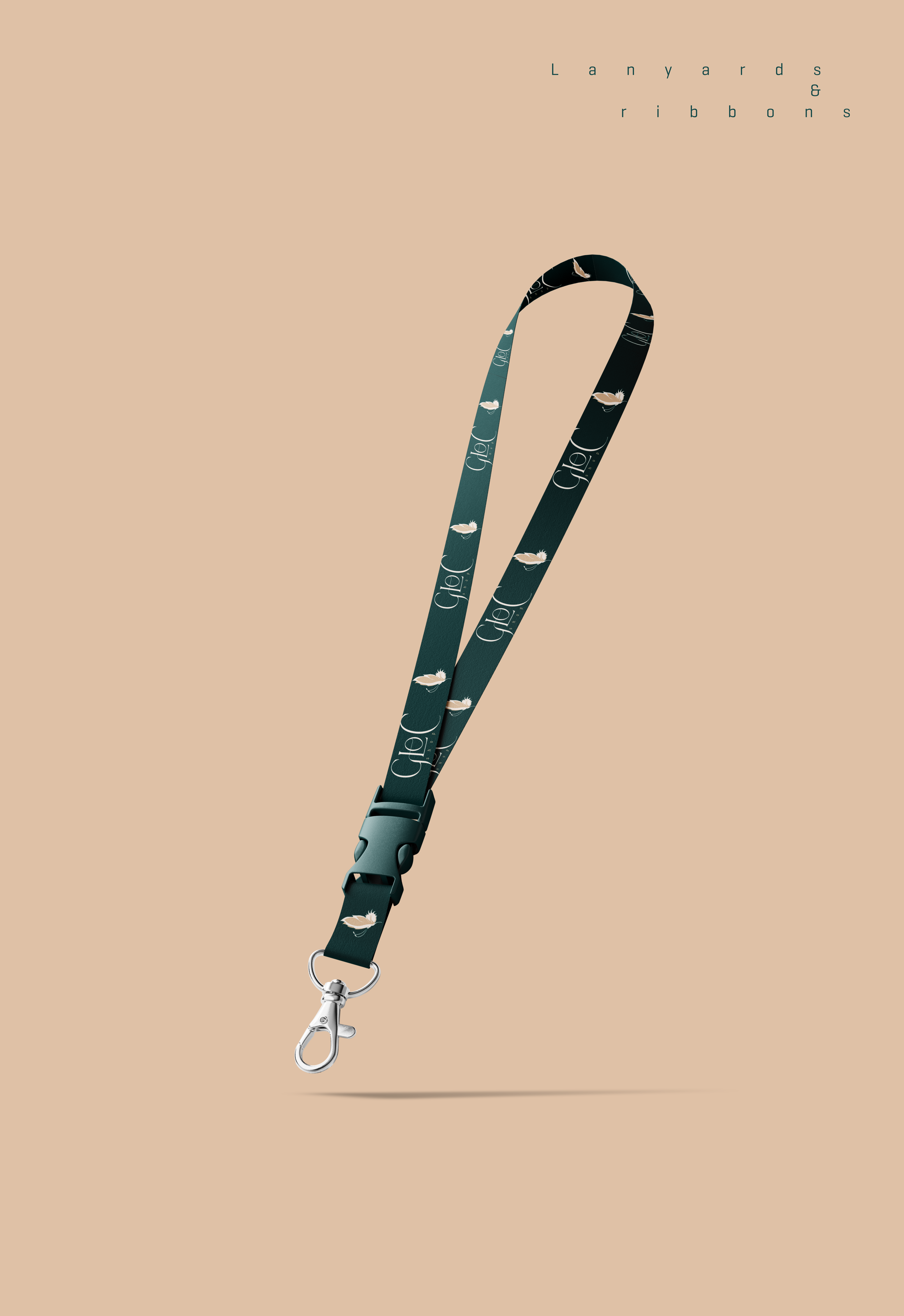
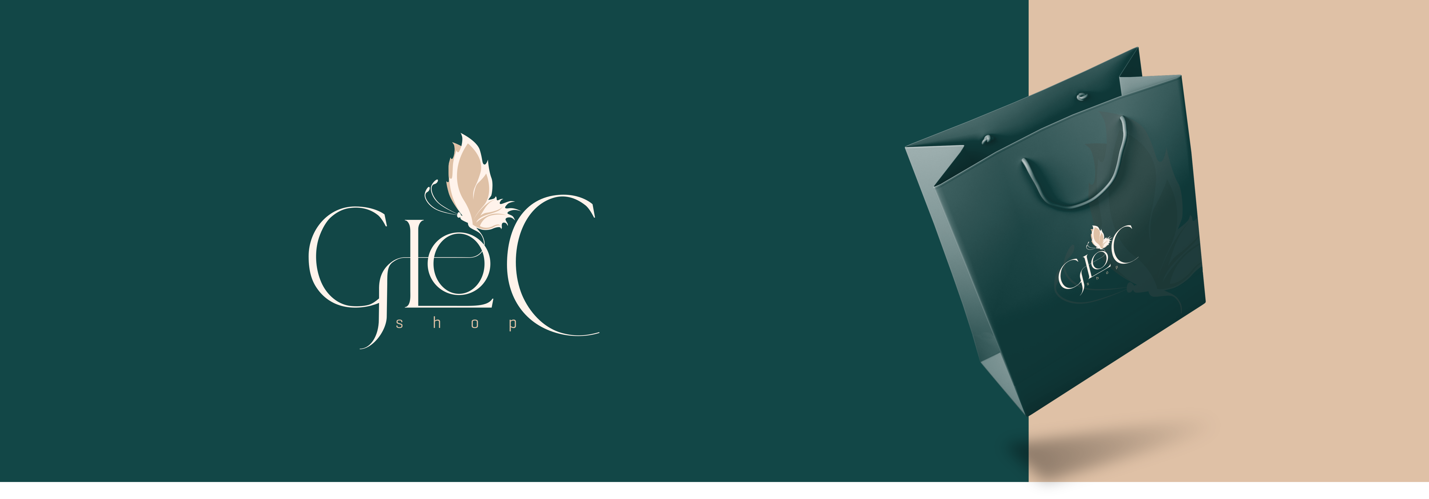
The idea behind GloC is built on simplicity, intention, and longevity. From the start, the goal was to create a brand that feels clean, classy, and timeless; something that won’t feel outdated with trends. The colour palette reflects this vision, using deep forest green paired with warm brown and soft beige tones. These colours feel natural and grounded, yet rich and premium, giving the brand a calm confidence without trying too hard.
The typography follows the same thinking: a refined serif font with elegant curves that feels feminine, mature, and stylish, while still modern. Nothing is loud or excessive every detail is deliberate. All this came together to communicate quiet luxury, good taste, and a sense of effortless elegance that speaks to women who value quality, style, and a classic lifestyle.

Lets get you started on your design journey as well.