Big Pig
Branding
This is some text inside of a div block.
Brand Identity Design

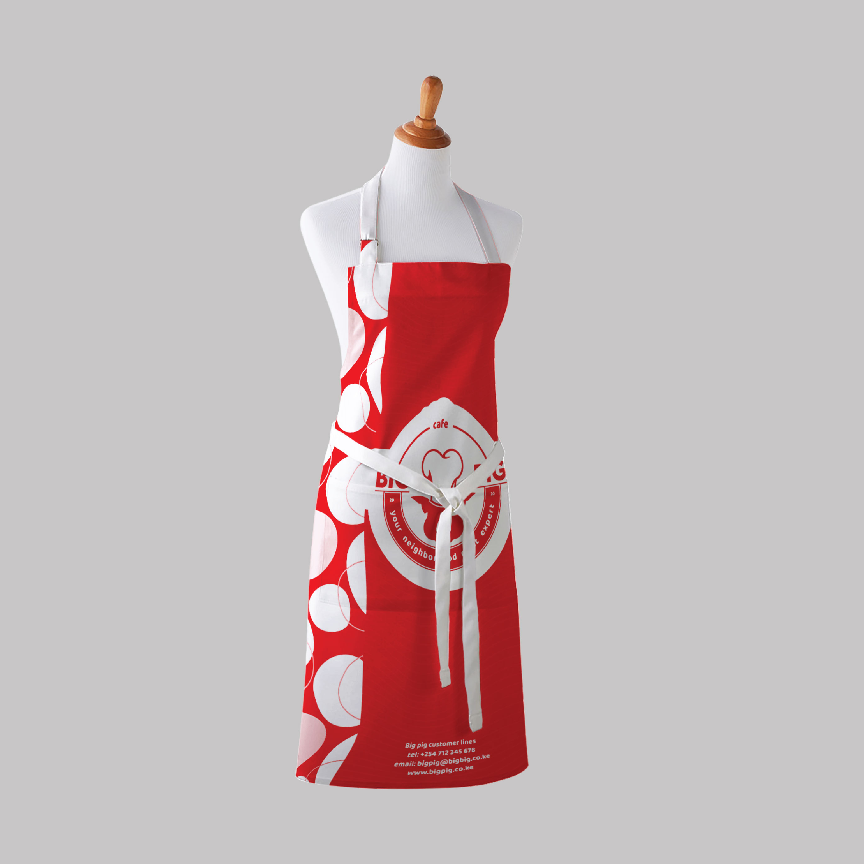
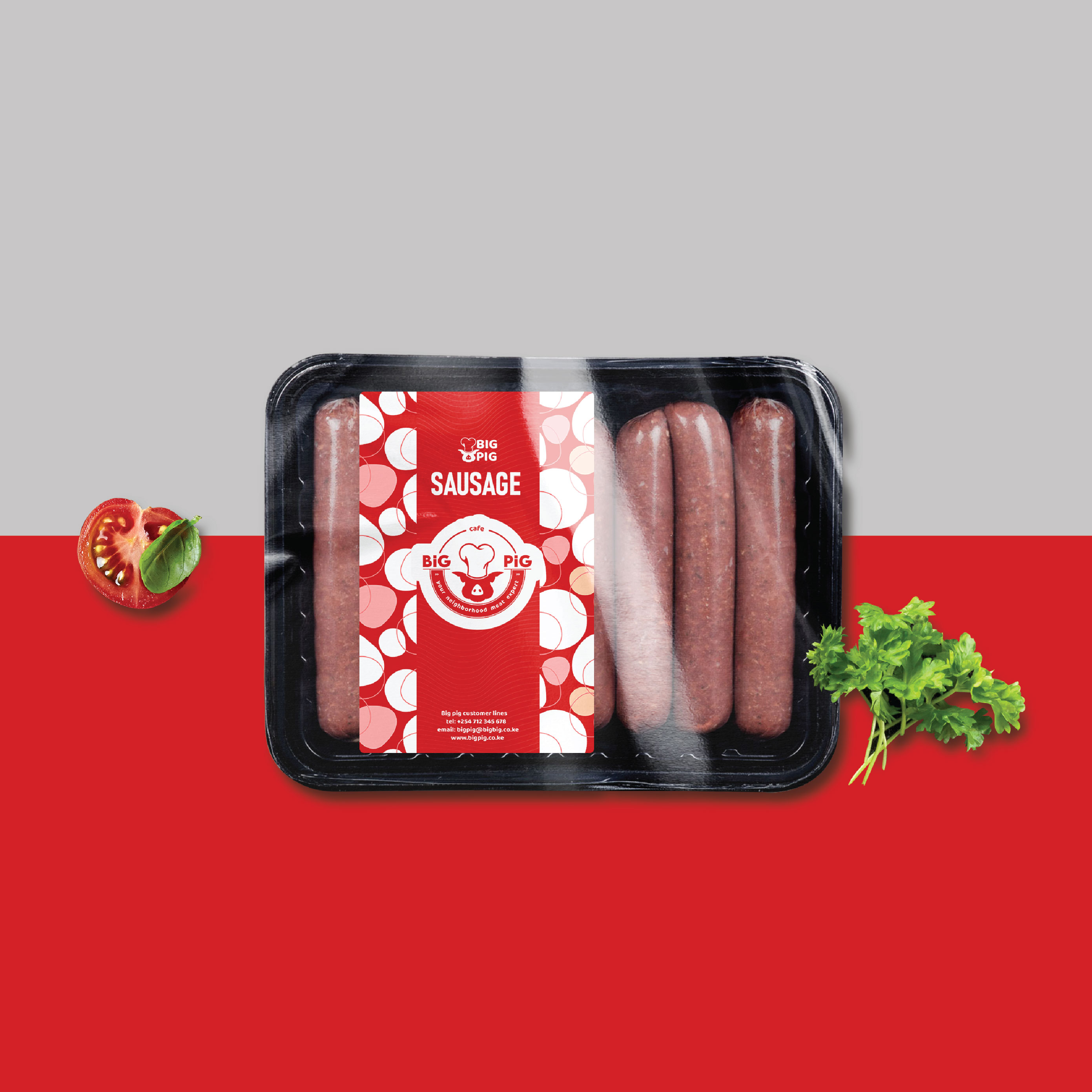
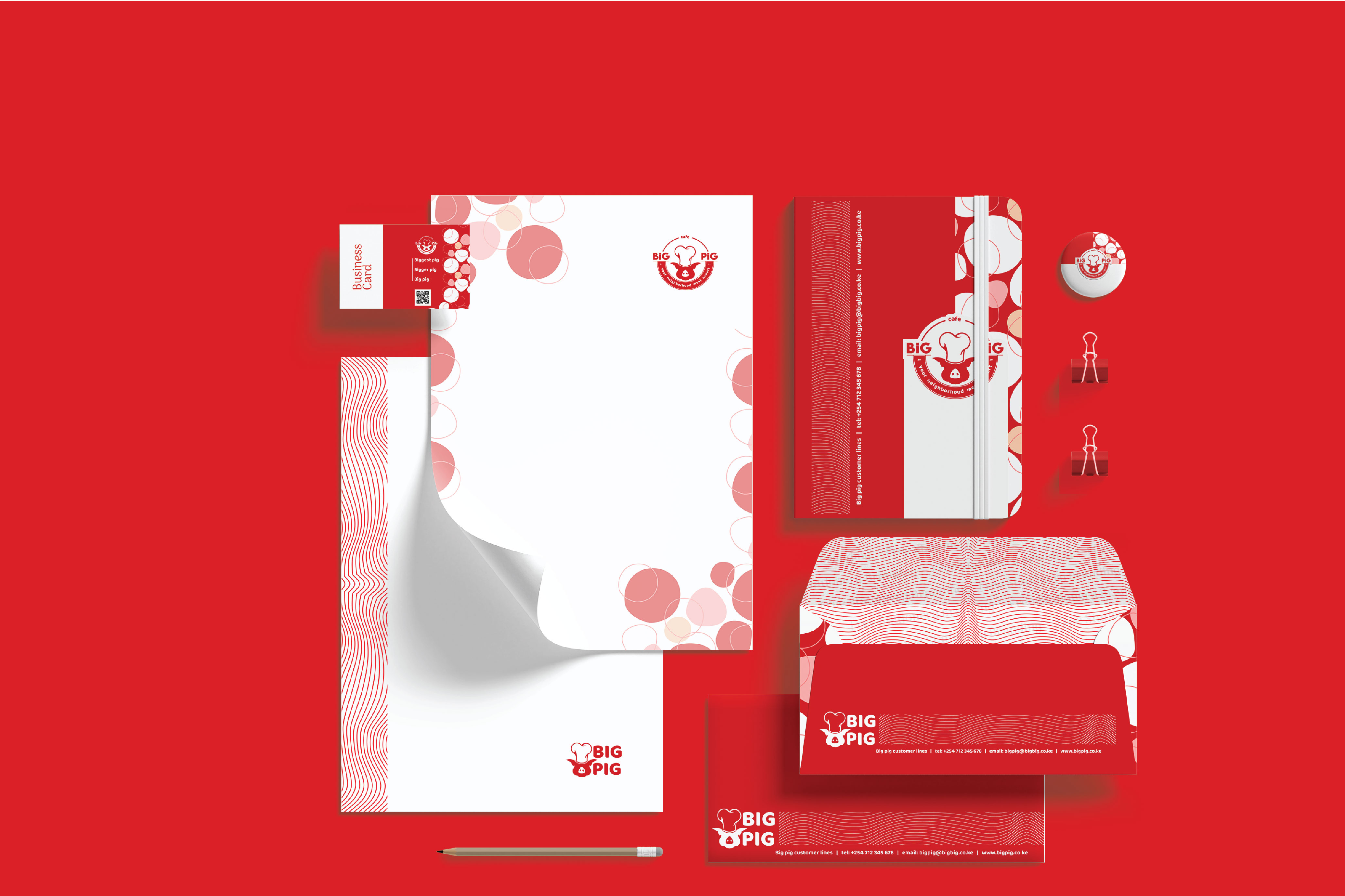
We treated Big Pig like a proper “neighbourhood nyama spot” it had to feel clean and trustworthy like a pork joint, but still lively and welcoming like a fast-food joint. So we built the identity around three things: visibility (stand out), clarity (easy to understand), and consistency (same look everywhere).
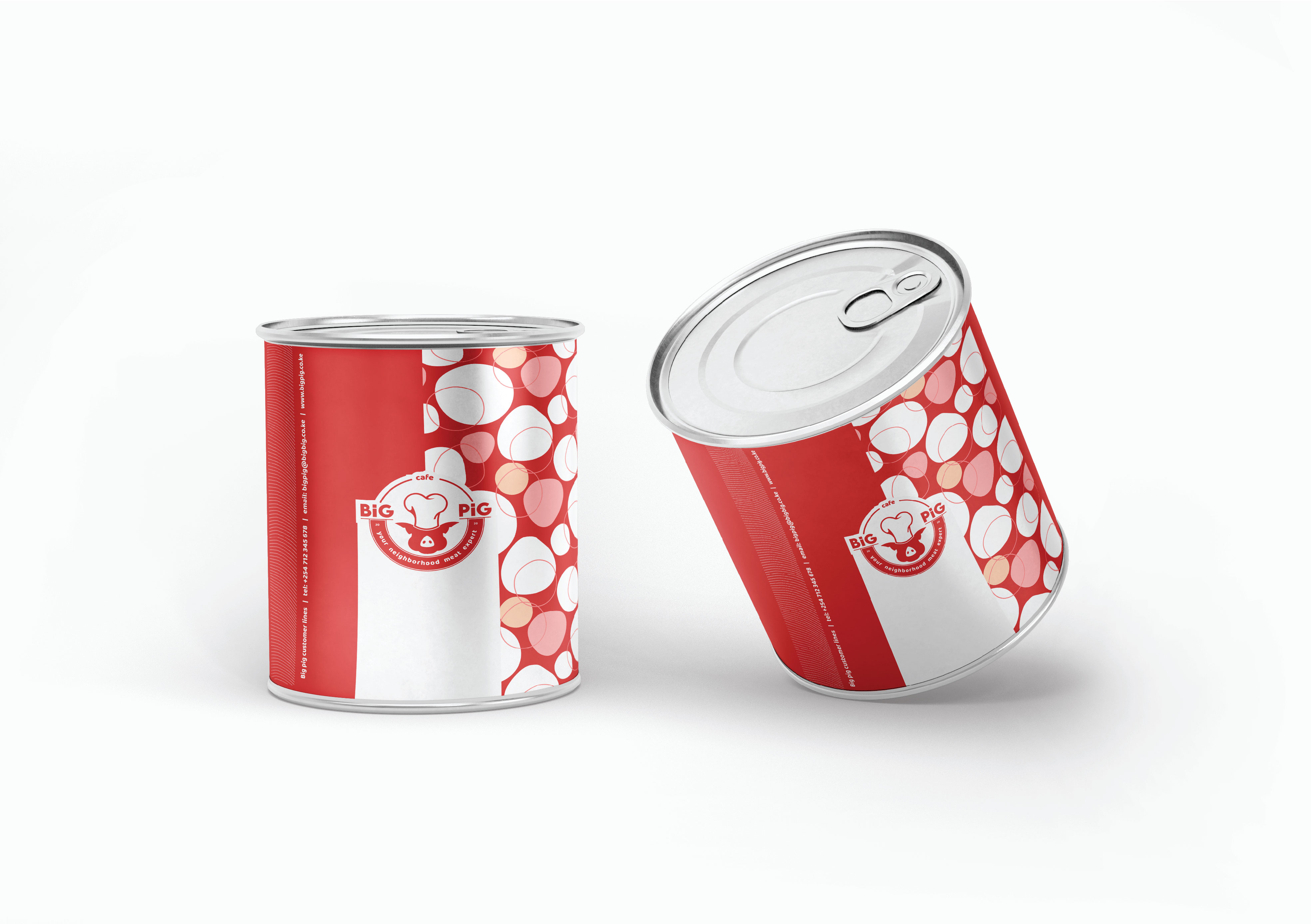
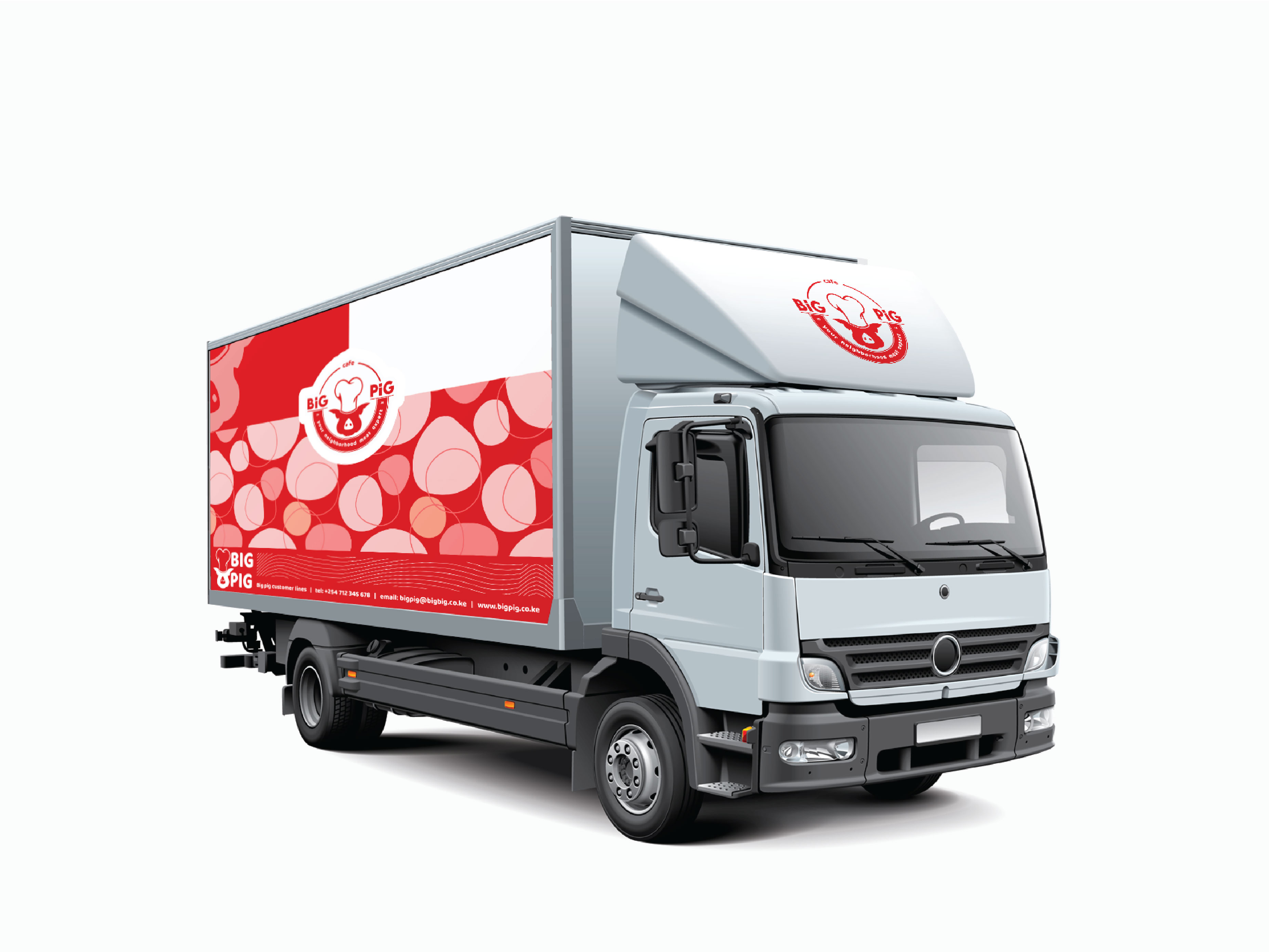
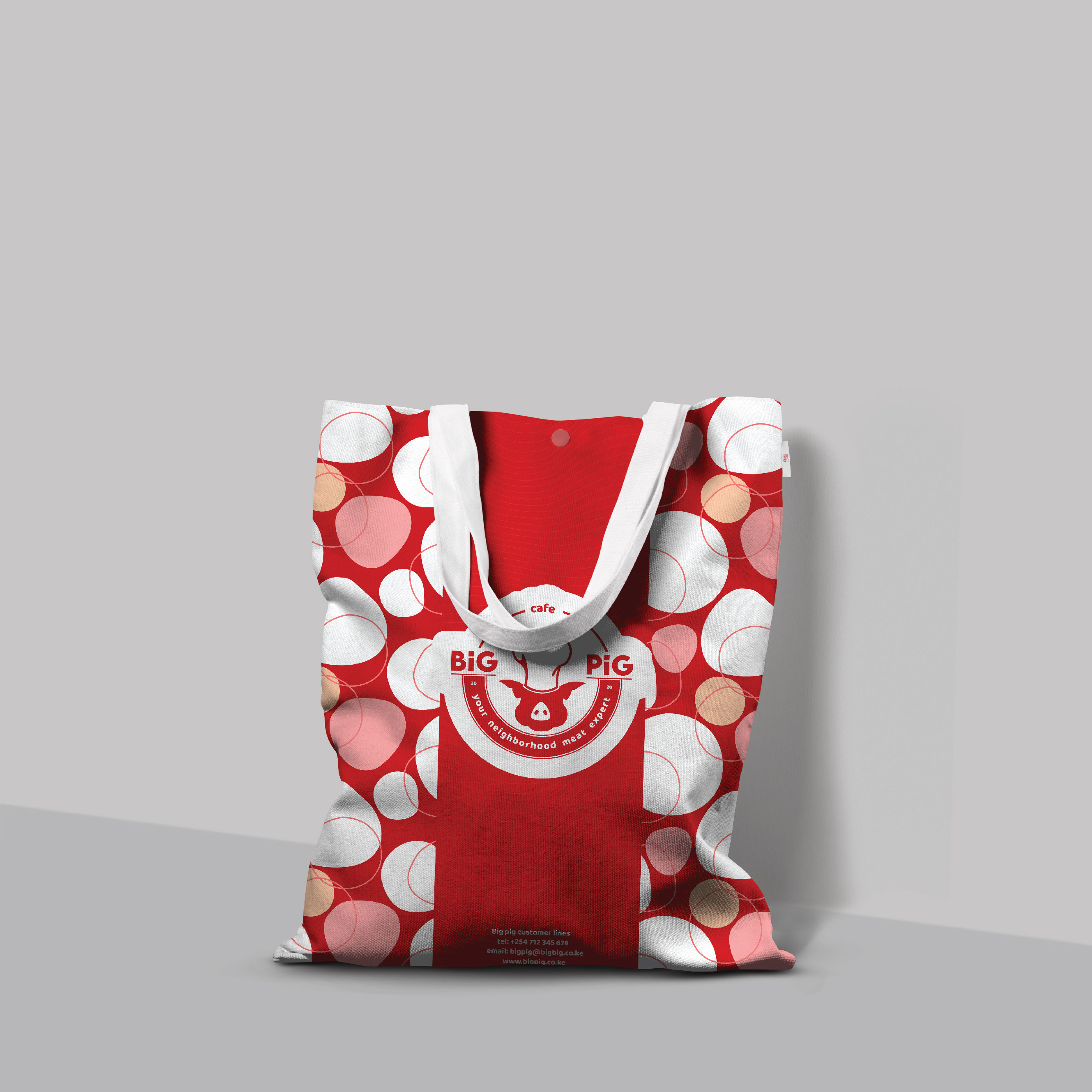
From there, we developed a bold red-and-white system with a friendly badge-style logo, plus a simple pattern inspired by meat cuts/slices so the brand can “wrap” nicely across packaging and uniforms without looking messy. We then tested the identity on real-world touchpoints: aprons, takeaway packaging, stickers/labels, stationery, merch, and delivery branding—so it works both kwa shop and online.


Lets get you started on your design journey as well.