Cactus Beach Bar
Branding
This is some text inside of a div block.
Brand Identity Design

A beach bar lives outdoors, so we designed for sun, salt and sand from the first sketch. The name gave us the idea: a hand-drawn cactus, the plant that thrives where it is hot and dry, paired with a loose handwritten wordmark that keeps the brand friendly rather than formal.
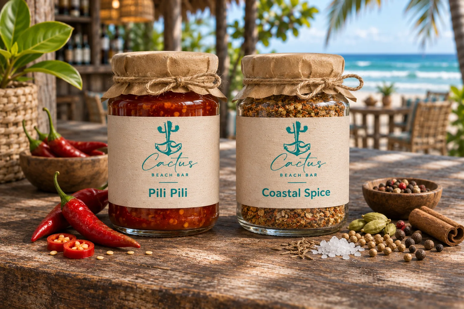
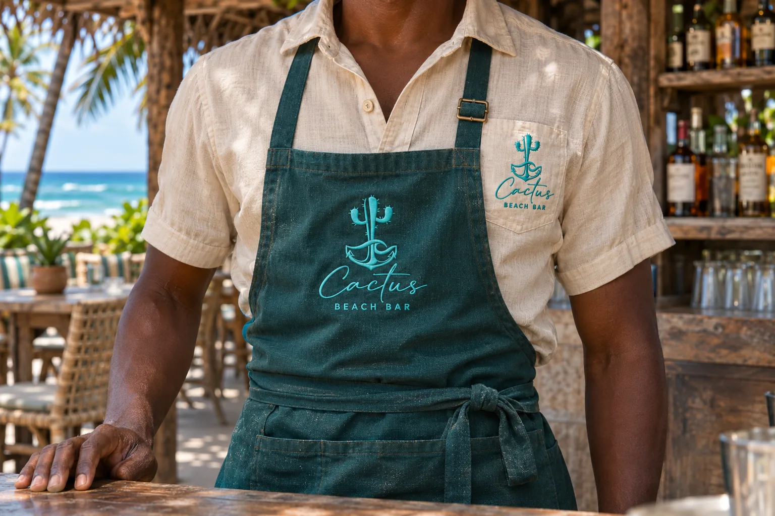
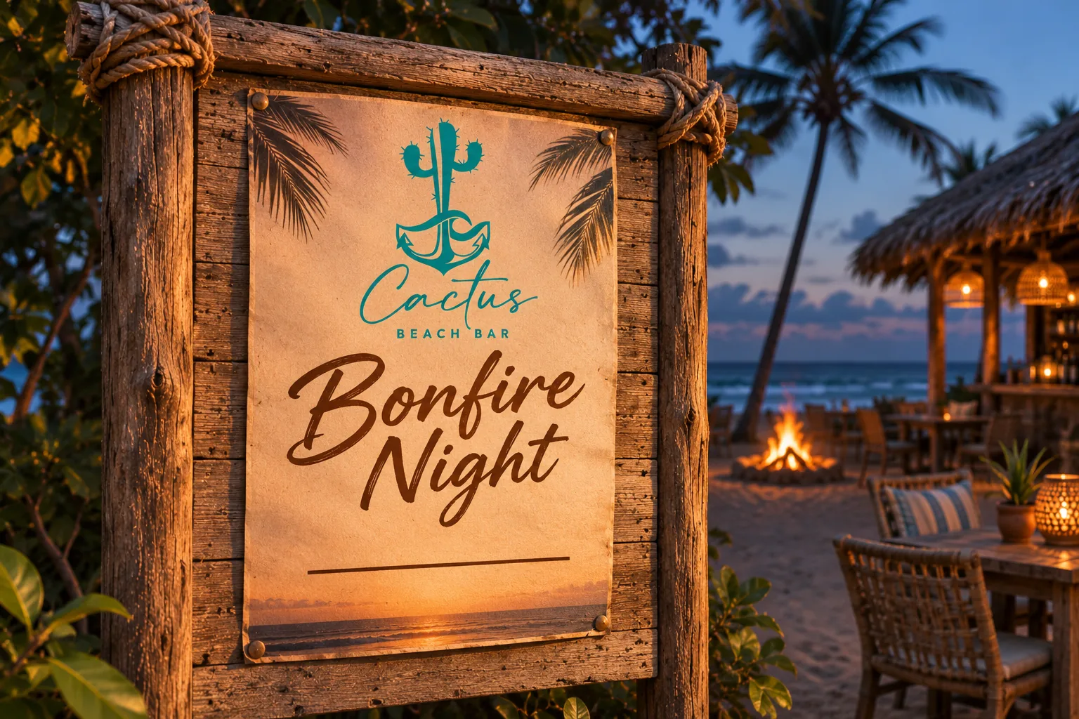
Built for natural materials. We kept the palette to one confident teal on sand, cream and raw timber, so the mark reads clearly whether it is painted on a driftwood sign, printed on canvas or stamped on a kraft box. One colour also keeps printing simple and affordable for a small business.
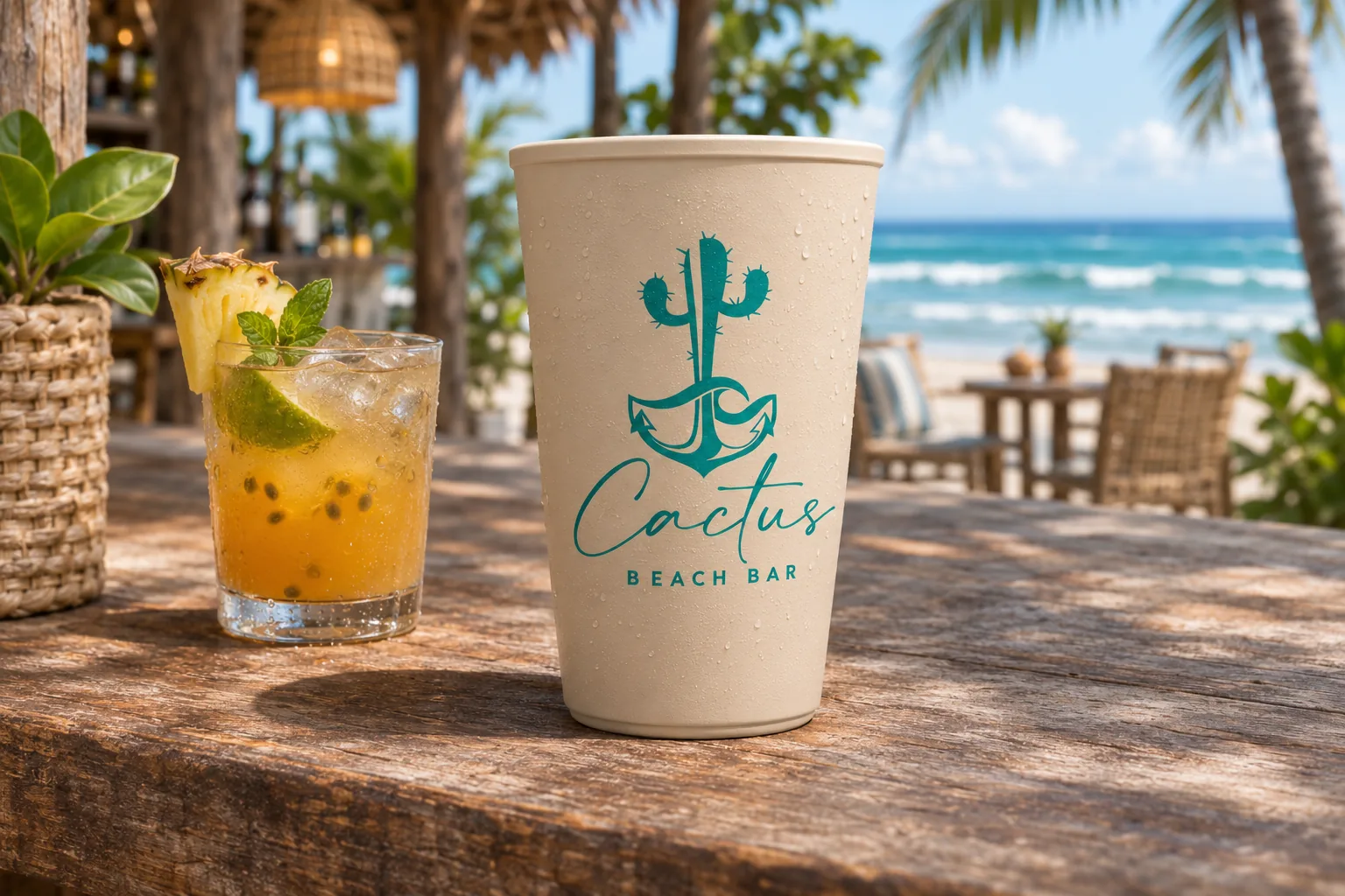
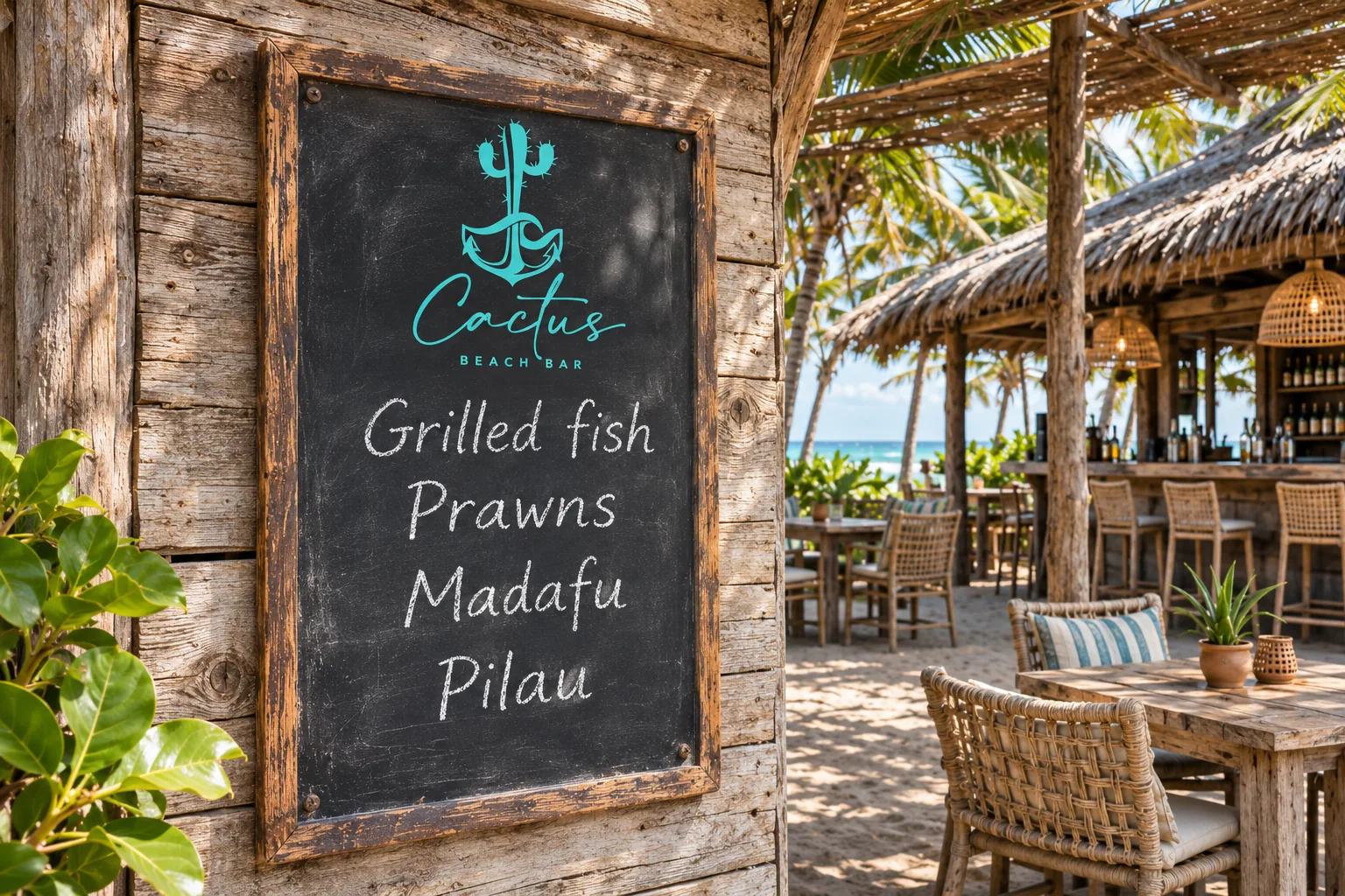
Everywhere a guest looks. We took the identity across the whole visit: the roadside sign, the entrance flag, chalk menus, cups and takeaway boxes, tags on fresh madafu, staff aprons, a tuk-tuk for deliveries, house spice jars, loyalty cards and posters for bonfire nights.
The result is a brand that feels like the coast it sits on: relaxed, warm and easy to remember.



Lets get you started on your design journey as well.