Arukah Health
Branding
This is some text inside of a div block.
Brand Identity Design

Arukah trains swimming in three ways: as a sport, as therapy and as a lifestyle. The identity had to hold all three without tipping into either a sports club or a clinic, so we set one rule: health without the hospital.
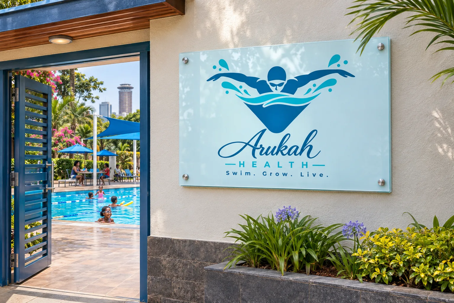
A swimmer in motion. The icon is a swimmer mid-butterfly, arms wide, cutting through a wave with splashes lifting off both hands, while the pool below gathers into a soft shield. It is all movement and joy, and the shield quietly says safe. A flowing script for Arukah, spaced capitals for HEALTH and the tagline Swim. Grow. Live. complete the lockup.
A palette that is pure water. Arukah Blue for the pool, Pool Blue for the splash, Splash Ice for the light on the surface and Midnight for sharp detail. We added a dark-background version with a Splash Ice outline, so the logo stays clear on blue kit and signage.
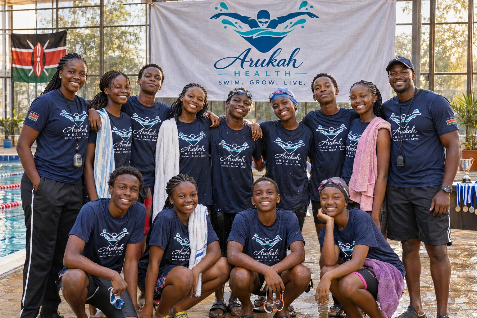
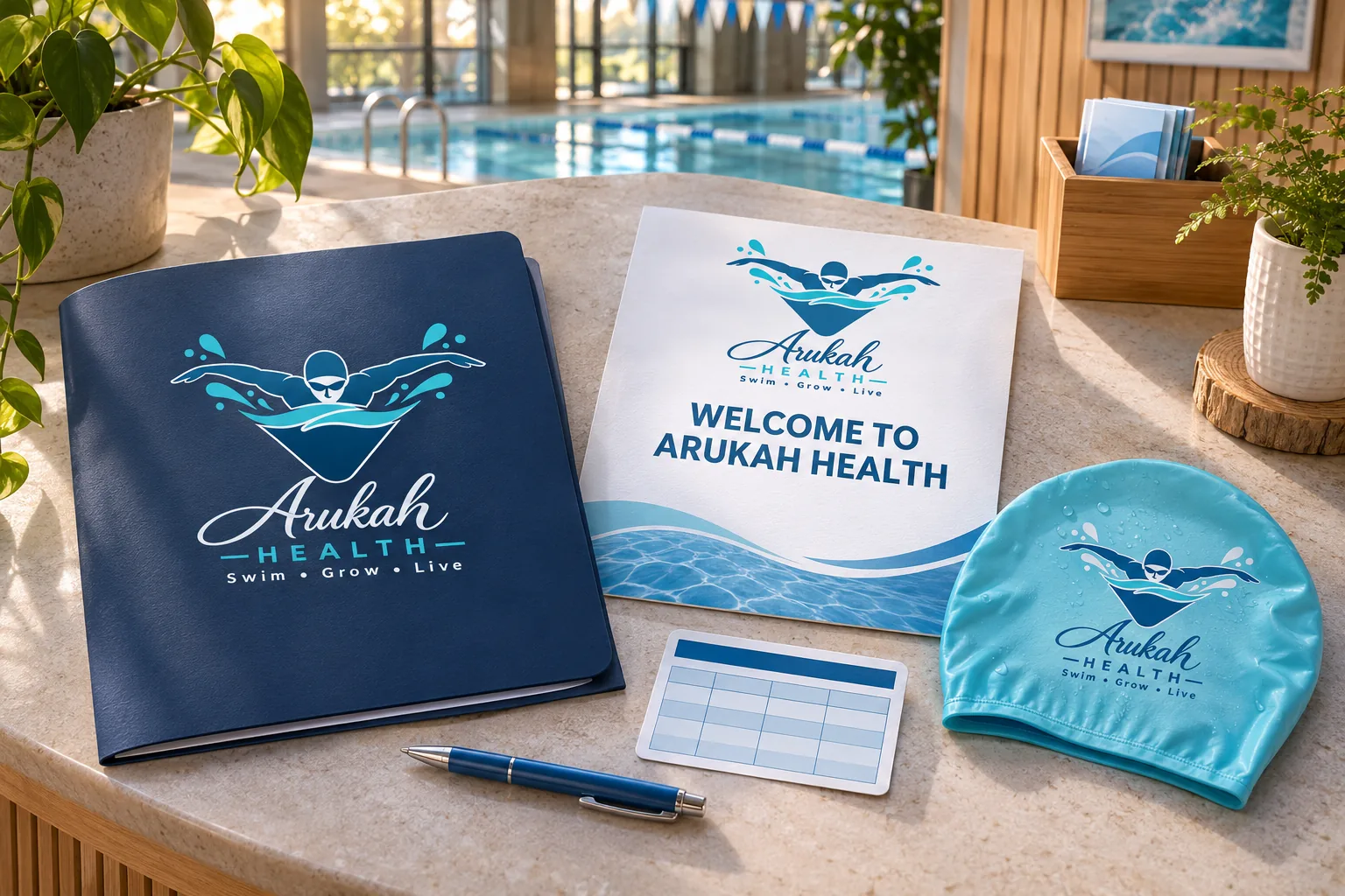
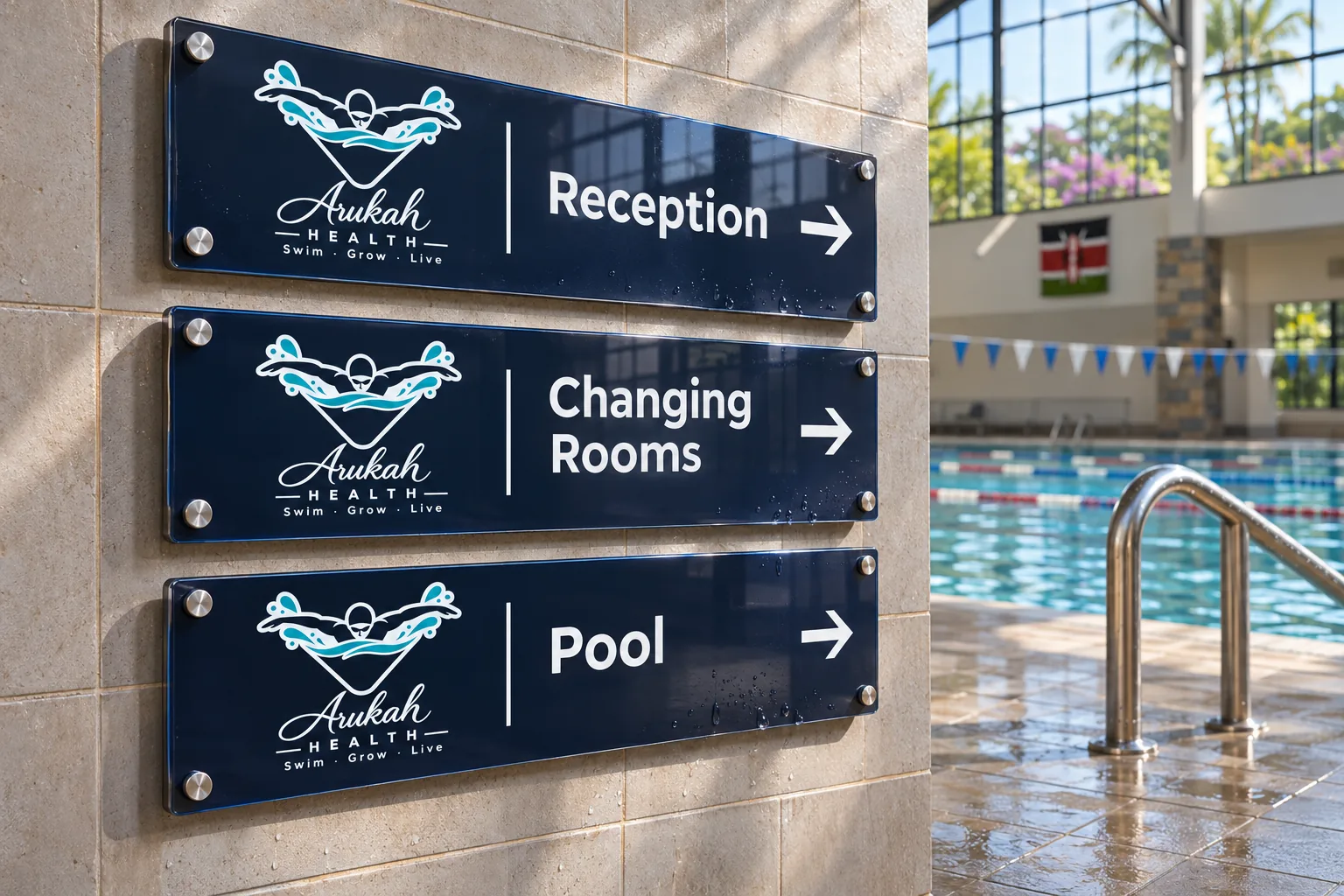
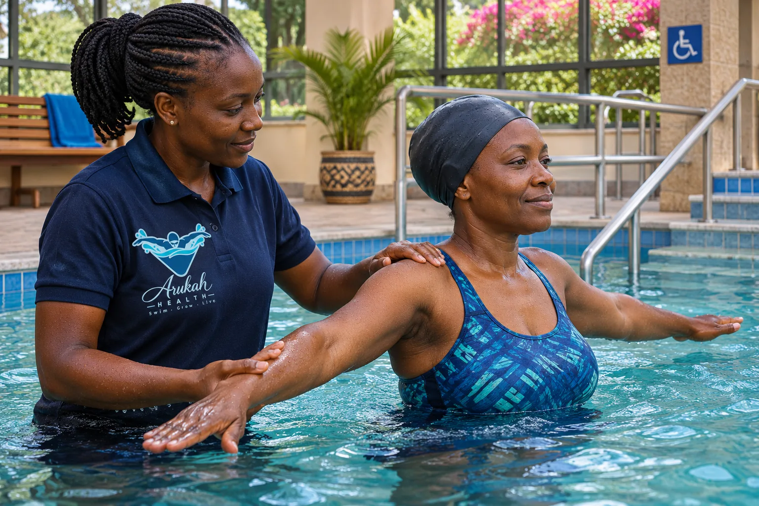
Words that coach. We wrote a voice like a great swim coach: warm, upbeat and clear, celebrating progress however small. Then we carried the system through everything a family touches, from the entrance sign and wayfinding to caps, towels, kit bags, coach T-shirts, session cards, progress certificates and the booking screen.



Lets get you started on your design journey as well.